ampixa
// write · sirijonga + devanagari ocr · limbuocr

The recognizer was never the hard part

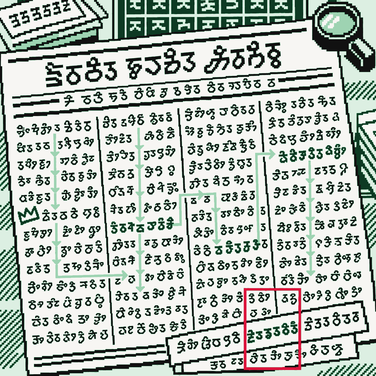
An isometric newspaper page, tilted off the canvas's own square, set in dense Limbu-style pixel-art print (a stylized illustration, not verified Sirijonga letterforms). A bright green arrow path zigzags wrong across the columns and the print it crosses turns to scrambled dark fragments. A crooked crown sits on the one line the wrong path never touches. In one corner a small tilted strip of print keeps its detection box upright instead of rotated, and in the last frame of the loop that box gets three crimson strokes slashed across it.

pixel-art illustration — glyph shapes are stylized, not verified Sirijonga (see the real script below)

0.474%codepoint CER · 902 held-out Sirijonga lines, three held-out dates
85.9%exact lines · same 902-line test
2.575%page CER · 3 held-out pages, one declared linearization
96.85%line-detection F1 · same 3 pages
76.17%exact matched lines · same 3-page result, paper §7.2
// the script itself · sirijonga, unicode u+1900–u+194f

ᤅᤠᤸᤄᤠ ᤂᤦᤱᤒᤡ ᤓᤠ ᤒᤲ ᤓᤢᤳ ᥄ ᤄᤡᤔᤨ ᤏᤧᤈᤣᤴ ᤝᤧᤱᤄᤢᤅ ᥈᥆ ᤙᤥ ᤔᤧᤱᤉᤡᤴ ᤊᤥᤷᤌᤡᤇᤢ ᤍᤆᤨᤲᤛᤨᤶ ᥆᥊ ᤖᤅᤢᤳ ᤐᤴ ᤅᤥ ᤅᤨᤕᤠ ᤍᤡᤍᤡᤏᤥ ᤁᤨᤵ ᤃ ᤕᤥᤐᤧ ᤐᤡᤵᤘᤢᤇ ᤗᤠᤊ ᤑᤢᤈᤨ ᤔᤜᤣ ᤇᤥᤁᤧᤵ ᤚᤌᤡᤳᤋᤠ ᤚᤡᤚᤣ ᤎᤥᤶᤏᤡ ᥇ ᤅᤧᤅᤧ ᤅᤢᤱᤑᤢ ᤛᤳᤊᤥᤶ ᤂᤏᤨ ᤒᤨᤷᤙᤠ ᤆᤡᤋᤨ ᤝᤣᤰ ᤑᤠ ᤏᤨ ᤗᤨᤐᤣ ᤞᤣᤅᤦ ᤖᤡᤴ ᤝᤥᤲ ᥈᥈ ᤈᤡᤐᤣᤶᤑᤦᤵ ᤘᤥ ᥈᥆ ᤗᤥᤊᤡᤳᤝᤤᤲ ᥇᥇ ᤙᤦᤖᤲ ᤗᤤᤲᤎᤰᤕᤤᤳ ᤉ ᥅ ᤒᤤᤂᤣ ᤉᤣᤕᤣᤸ ᤉᤠᤂᤨ ᥉᥊ ᤑᤧᤶᤖᤦ ᤗᤣᤛ ᥇ ᤍᤛᤡ ᤎᤡᤍ ᤔᤤᤲᤆᤠᤵ ᤈᤤᤲᤁᤡ ᤈᤠᤱᤅᤠ ᤊᤡᤑᤶ ᤘᤲᤂ ᤘᤨᤸᤙᤠᤓᤣᤰ

No sentence here is a transcription of anything — no source read for this page quotes an actual Sirijonga sentence, so this is generic script texture: real, assigned Limbu letters (Noto Sans Limbu, checked by eye in a browser for correct vowel-sign attachment before use — never drawn with Pillow), arranged with no claimed meaning. The script is named for Sirijonga, a Limbu culture-hero credited with inventing it; it was revived centuries later and standardized by the scholar Iman Singh Chemjong in 1925. Gorkhapatra, the newspaper this project reads, already dates its own masthead three different ways at once — Bikram Sambat, Gregorian, and the lunar Nepal Sambat calendar. There has never been one single correct way to read this page.

Open a current e-paper PDF of Gorkhapatra's Limbu-language edition — the test dates in the project's own evidence land in 2025–26 — and try to search it for a word, the way you'd search any other text. You can't. Sirijonga has its own Unicode block, but the newspaper doesn't set its Limbu columns in it; it uses older legacy fonts that store the text as ordinary byte codes mapped to the wrong letters. Copy a line out of the PDF and paste it anywhere else: garbage. A national daily is still publishing a script its own files can't represent correctly.

That mismatch is useful, though. Knowing which font the newspaper used and which byte maps to which letter, you can walk the PDF's own hidden text layer and convert it back to real Unicode Sirijonga — line by line, matched to the exact image crop it came from. You get a transcript for free, generated by the newspaper's own files, with nobody typing a word. It's not a human transcription — font maps can be wrong, text can arrive out of order, and the project marks the whole thing "silver," not gold. But it's real print: 2,711 real lines for training, split by publication date out of a larger 4,872-line collection so no date appears in more than one split.

Fine-tune a standard PaddleOCR recognizer on that, and the result is genuinely good: on 902 held-out lines from three dates the model never trained or tuned on, the character error rate is 0.474%. Grapheme error — the full assembled letter, not each underlying code point — is 0.979%. 85.9% of lines come out letter-perfect. That number shows up, worded almost identically, in the project's README, model card, published paper, and live demo.

// try it · same predictions, two stitching rules

A page isn't one long line. Stitch it wrong and the same correct reading scores ten times worse.

On a set of 16 regression pages, researchers ran the exact same recognizer, with the exact same predictions, and scored it two different ways. One way of stitching the lines together gave 41.34% character error. A different, more careful way — grouping by column instead of just sorting by vertical position — gave 4.329%. Same model. Same output. A tenfold gap, entirely explained by a decision made after recognition was already done.

Sixteen boxes stand in for sixteen printed lines on a four-column page — fixed in place, the way print never moves. Only the path changes: column-major reads straight down column one, then column two, never crossing early; naive top-to-bottom reads by vertical position alone and zig-zags across columns instead. Every line the naive path crosses mid-column comes out scrambled — not because the recognizer misread it, but because the wrong neighbor got stitched next to it. This board is illustrative, built to show the mechanism — the real 41.34%/4.329% figures are measured on the actual 16-page regression set, not on this board.

// internal only · not in the public paper

There's a smaller version of the same lesson the team has found but hasn't finished publishing. An internal note describes a check on 43 hand-labeled lines of tilted text: when detection boxes stay upright instead of rotating with the page's actual tilt, they bleed into neighboring lines and the error jumps to 21.4%. Rotate the crop to match the skew first, and it drops to 2.9%. The published paper doesn't have that number yet — it still lists skew and capture quality as open, unscored future work.

21.4% → 2.9% CER, 43 hand-labeled lines — source: a private engineering note (quoted in an independent audit), not the public LimbuOCR paper or README. Shown here because the task asked to verify it; kept apart from the proof strip above on purpose.
// how it works · one measurement chain · dashed = unverified or internal-only
gorkhapatra pdf16 editions legacy font layernamdhinggo → bytes limbu_legacy.py+ limbu.map ~25,065 syntheticfont source: undocumented silver pack2,711 / 1,221 / 902 pp-ocrv5 fine-tunelimbu-sirijonga-ft-v2 line score (902)0.474% cp · 85.9% exact page assemblyreading-order linearization page score (3 pages)2.575% cp · 96.85% f1 · 76.17% exact skew / tilt (internal)21.4% → 2.9%, n=43not in the public paper

The skew node branches off page assembly specifically, not the line score or the fine-tune — its only source is a private engineering note, not the published paper, which still lists skew as open future work. The 41.34%/4.329% reading-order pair isn't drawn as a box here; it's the live board above, because that pair is a traversal rule applied to this chain's own line-score output, not a separate stage of it. The 50-language registry, the Newar-in-Devanagari diagnostic, and the private release repository are deliberately left off this chain — different stories, not this one.

// an old bug, a familiar shape

Nepali computer users have lived with this exact trick for decades

The legacy-font problem LimbuOCR's converter reverses for Sirijonga is the same bug an entire generation of Nepali desktop users already knew under a different name. Fonts like Preeti stored Devanagari- looking text as plain Latin bytes — a document that looks like Nepali only because the right font happens to be installed, pure Latin-coded garbage underneath, correct only by coincidence of which font the reader's machine has. Swapping the font back never recovers real Unicode; someone has to know the map. Gorkhapatra's Sirijonga columns are the same trick, one script and one font family later.

// limits & what's missing
// receipts · every number on this page is in facts.md